MPN Accountants approached me at the very start of setting up their new business. They needed a professional brand identity design from the outset, as part of their application to be officially certified as chartered accountants.
This involved trusting in the creative process, as you’ll see from their wonderful insights in a moment.
The act of ‘handing over’ your brand/ vision to someone is understandably hard, because it’s such a personal entity, encompassing your hopes and dreams. Sometimes these ideals have been safely harboured for years before seeing the light of day. However the beauty of this creative process is that you’re involved every step of the way. Rather than an act of ‘handing over’, it’s an act of entrusting. We work together to discover, understand and showcase all that you stand for. Seeing your brand transform and take shape along the way.
Your business distilled in colour and form.
The Problem
MPN Accountants were trying to figure out how and where to start with creating their identity to position and set themselves apart within the crowded market. They wanted their new business to instil confidence and assurance, drawing from their years of experience and skill sets. It warranted a fresh look and feel, so that their brand felt welcoming and approachable for their core market, whilst also feeling established and dependable.
The Solution
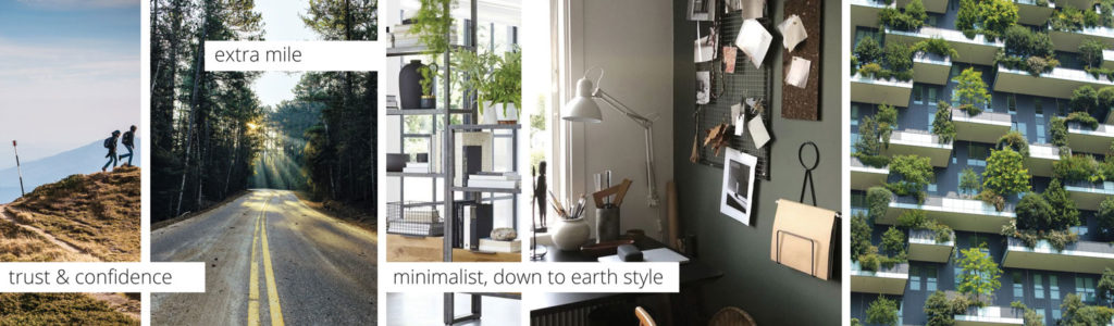
Starting with the brand worksheets we drew out MPN’s values and vision for their business. Then after researching and exploring MPN’s brand positioning the next stage was to visually capture and present the look & feel of MPN’s new brand. Ensuring they loved the design direction. This involved creating a brand style mood board. Transforming MPN’s values in a tangible, relatable way, that expressed what mattered to them most and made them unique.
The style mood board also forms an invaluable visual reference for MPN when they’re selecting their own imagery and content for their website and social media. Providing instant guidance to help them select images that reflect their values and add to their story, whilst maintaining a consistent look and feel.
The core brand colours were carefully selected to help set MPN apart within the market, which is predominantly saturated with blues, and closely followed by purple. Each colour communicates a value or feeling, varying between shade and tone. For MPN’s core colour palette it was important it represented reassurance and growth, creating a clean, approachable, down to earth, look and feel.
This was accomplished by drawing on the characteristics of rich green and dark slate, each with blue tones representing reliability and calm. The slate adds an element of black, a serious colour, but with a softer, approachable feel. Also a nod to ‘being in the black’ – where their clients all aspire to be. The rich green is associated with reassurance, trust and wealth, as well as growth and nature. The addition of white creates space, balance and light, representing the feeling of removing that burden of financial reporting to allow their clients to focus on their core business. These match perfectly with the integral values MPN stands for and the qualified, professional service they bring to their clients.
The bespoke logo design created for MPN, is a combination mark – incorporating monogram, symbol and words to identify straight away what MPN does.
A sans serif font was selected for its structured, organised clean lines and approachable feel in different layouts ready for print and web. The monogram element gives a traditional yet contemporary feel with stylised ‘N’ created from strong, supportive triangular ‘building blocks’ ends in an arrow, representing profit and growth. The solid blocks of colour used here add impact, drawing your eye to the brand, helping MPN to further stand out within the market.
Trusting In The Process
MPN Chartered Accountants share their insights on the creative process:
“In approaching a designer I was concerned about being outside of the process and not knowing if I would like the final design. Shouldn’t have worried though. Creating the brand from the original questionnaire, it meant that despite not being ‘in control’ of the image it is still personal to me. Becks is very knowledgeable and talented and has a clearly defined process to help you build a brand that is very personal to your business. Love it! It fits the brief completely” MPN Accountants – Swindon
The Result
A bespoke set of brand assets and guidelines that MPN can use straight away to brand their business stationery, website and social media platforms to start building recognition and awareness of their brand. Allowing MPN to feel in control and at ease with their new identity which they can now gradually build upon over time, as and when they need it. Achieving a consistent brand identity from the very start.
Delighted to report that MPN have successfully been awarded their certification!
Very excited to see their business grow from strength to strength.
Transform your brand
