There was so much to draw upon from Oakhaven Hospice’s important heritage through to their objectives and vision for the future.
The work Oakhaven do, and their passion for their work, is truly astounding! It is a real privilege and honour to have been chosen to help them develop and prepare their new unified brand ready for the next chapters ahead.
Designing for good. Honouring heritage. Embracing the vision.
The challenge:
Unify their identity and voice across the different services and community
Oakhaven as a community provides a variety of care, support and services which has grown and stemmed from the original purpose led mission of the hospice; to provide specialist care and support to local people dealing with life-limiting illness. Families facing some of the hardest times of their lives.
“We believe in respecting the individual’s dignity and choices and enhance the quality of care for patients in all care settings through partnership, collaboration, advice and education” Oakhaven Hospice Trust
Ahead of the game, Oakhaven were already innovating, partnering and collaborating – a strategy and strength we’ll see more of in the future of the changing charity sector. Providing the ability to meet the everyday needs; physically, emotionally and practically with respite care, day-to-day care, fresh meals, wellbeing, activities and education to name just a few. Throughout each of these is the solid shared vision of ‘making every moment matter’, providing excellence in quality of care, support and compassion.
However, there wasn’t a strategic, clear identity across the different services. Each entity was using individual names and colours that didn’t relate visually as a collaboration. So the identity needed to be developed to unify these different services, inspire, motivate and support internally within the Oakhaven community and externally within the local community in The New Forest and beyond.
The solution
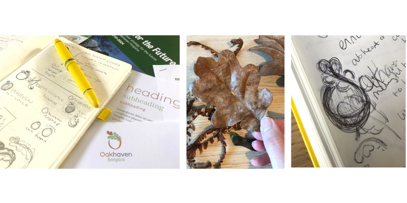
Design process; laying the strategic foundations to build a brand for long term success
Research and reflection was carried out to understand Oakhaven’s story, values, vision and motivations. Talking with members from each area within the community to find out what Oakhaven meant to them personally, as well as any challenges, needs and hopes. These insights were invaluable and wonderfully highlighted what makes Oakhaven unique and such a special place.
Next, developing the look and feel. Distilling Oakhaven’s values and purpose through a new colour palette, design identity, brand assets and styling to create a unified identity and voice.

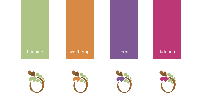
Selecting their brand colour palette to reflect their personality and values
The colour palette was inspired by the changing seasons within their amazing location in the New Forest, Hampshire. The colour palette radiates warmth and reflects the natural life cycle. This adds a sense of normality, presence and a calm welcoming haven. Each colour is used to define a different part of the collaboration and their services, to maintain an important aspect of individuality whilst unifying the strands together within the over-arching core identity and values.
![]()
Evolving the logo design to bring the brand up to date, refreshed and aligned with their objectives for the future
The rebrand included compassionate development from a fixed, single emblem style, into a combination logo mark (word and image combined) to provide the flexibility of use, ready for the various digital applications for today and tomorrow’s world. Preserving the heritage of the hospice in a new simplified and unified identity. An identity that symbolises care, compassion and a welcoming haven.
The stylised oak leaf design curves gently over the acorn shape forming the letter ‘O’ and preserves a representational link with the original logo, which featured an oak tree emblem complete with roots. The new simplified form focuses on the feelings of personalised individual care, a welcoming embrace and protective haven. This format allows the team greater flexibility, creativity and digital capabilities in their messaging and campaign work to keep their cause relevant and build brand awareness in alignment with their objectives and outreach.
The five curved lobes of the oak leaf are created with stylised hearts and represent the different services and partnerships within the Oakhaven community, all sharing the same values and ‘making every moment matter’. The team make such a difference to the lives of their clients and their relatives. The significance of the ‘five’ also maintains a personal link with the original logo which featured five acorns.
The new identity represents care and compassion, whether experiencing Oakhaven as a client or their next of kin and family, the medical team, carers, staff, volunteers, fundraisers or stakeholders. Becoming a unified symbol that relates and communicates personally.
The results
A united brand focus with shared values at the heart of the design, ready for the next chapter.
“I have shared with various stakeholders the recent ‘brand development’ document you sent over. I have to say it has gone down extremely well. You have absolutely captured the ethos and feel of what we stand for. We are very excited and I’ve just met with the Newsletter designer and given her all the info on pantones, guidelines etc. Becks is great to work with…calm and pragmatic at every stage. Thank you Becks” Amanda C. Head of Fundraising & Communications, Oakhaven Hospice
It’s always fantastic hearing the excitement from the team when the identity is brought into realisation. And always exciting and fulfilling seeing them gradually implement and introduce their new identity across their brand touchpoints, knowing it will go on to have a positive impact internally and externally.
“What a pleasure and a delight it was to work with Becks. From the outset she understood who we were and what we wanted to achieve. Professional, timely and competent. I would highly recommend Becks and would not hesitate to work on a project with her in the future.” Amanda C. Head of Fundraising & Communications, Oakhaven Hospice
Their new identity has already inspired a personal fundraising initiative by one of their talented volunteers creating jewellery charms in memory of loved ones.
Take the first step towards your brand adventure today and book your no obligation discovery call to talk about the change you want to create in the world through your brand.
Design to tell your story.
Image: Annie Spratt | Unsplash
Design: Becks Neale

[…] with you some insight on how your charity can use these lessons of the past and adapt them to your charity branding and messaging for your […]