Why they are critical to your brand communications
By this I mean more than simply knowing your brand colours basic colour name; red, blue, yellow etc, and beyond their wonderful descriptive name for example; cranberry red, seagrass blue, sunshine yellow. Let’s discover why.
Imagine you are planning on restyling your lounge. You want to create a calming, coastal feel. Perhaps painting a feature wall with a refreshing ‘seagrass blue’, complemented with the palest of white sand with soft warming yellow tones on the other walls. You also want to accessorise with splashes of colour by adding some soft furnishings with cosy throws and cushions in contrasting textured fabrics, some new curtains that pick up the ‘seagrass blue’ colour. You head online to see what’s available and find some items that look like the perfect fit, they even use the same colour description. Excitedly you order them. Yet when they arrive your excitement quickly turns to disappointment as the tone of blue was not what you were expecting. It clashes and detracts from your scheme rather than adding the harmony and rest it was meant to.
The issue
The issue is that colour (just like design and artwork) is subjective. Everyone perceives colour differently. When you see colour, it makes you feel something. Depending on how it makes you feel this influences how you interpret the colour and the impression it makes on you. Does that make sense? So for instance going back to the ‘seagrass blue’, one person might associate this description with more of an aqua blue whilst others a soft greyish green, and another a yellowish green and more. (If you do a quick image search for ‘seagrass paint’ you’ll see the many variations that appear).
The other issue depicted within our styling scenario above, is that the photos viewed online aren’t always an accurate representation of the physical colour. Factors that influence what you see on screen, firstly depends on your screen and it’s colour calibration, and secondly the lighting that was used for taking photograph in the first place, photo optimisation, and then compression in preparation for uploading to the website.
You’ll notice the lighting effect on colours when you go around shops. Clothing, bedding, furniture etc their colours can look different within the store, compared to when seen in natural light or even in your own home. Which is where swatches come in to blissfully ease the process. Paint swatches and fabric swatches, that you can test out in your chosen room. This allows you to see how they make the room feel during the different times of day. There might be times when the sun comes streaming into the room, overcast periods, times when you need to add some extra light. Light constantly and beautifully changes throughout the day and into the evening. Do the colours you’ve chosen help make the room feel like you want it to feel?
Colour swatches
PANTONE® swatches help achieve these kind of results for your brand. Not only can you use the swatches to identify the best match for example when selecting physical items; merchandise, gifts, trimmings, work wear, specialist print, stationery items and anything that your heart desires. Swatches are also critical in helping you to create a consistent appearance (to the extent of what is within your control) between screen and print.
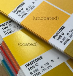
When you send your stationery for print, it’s important that you are aware that different materials will absorb the inks differently. Your choice of paper stock will affect the end appearance. For example uncoated stock is more absorbent so it will still produce a beautiful finish but it will more subdued and toned down compared to if you printed on a coated stock, like silk or gloss, where the ink sits on the surface allowing the colours to be more vibrant. As you can see here the same colour yellow looks quite different on the two types of paper stock:

PANTONE® is a registered trademark of Pantone Inc.
By knowing your PANTONE® colour swatch reference, for example for coated materials (denoted by a C after the PANTONE® number) you can match to the closest uncoated PANTONE® colour (denoted by a U after the number) to keep a consistent look across your brand touchpoints.
So what do you need to know about your brand colours?
- How do your brand colours make you feel?
- What impression do they give about your business?
- Your PANTONE® references for your brand colours – standard universal colour matching system. PANTONE® is also used for specialist printing, providing the specific ‘recipe’ to make the individual ink colour.
- The CMYK values – this is the percentage of Cyan, Magenta, Yellow and Black that make up each of your colours for printing
- Colour HEX codes – to specify colours for html and your website (when output is for viewing on screen, which uses an RGB colour space; Red, Green, Blue)
If you need to refine your brand colours and would love a professional hand with this, providing you with clear colour brand guidelines send me a message for more details and pricing- click here
