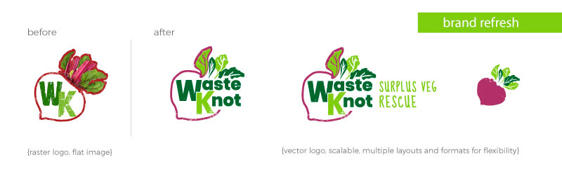
Brand development to strengthen and define Waste Knot’s visual identity and style
‘Brand refresh including house illustration style and brand literature’
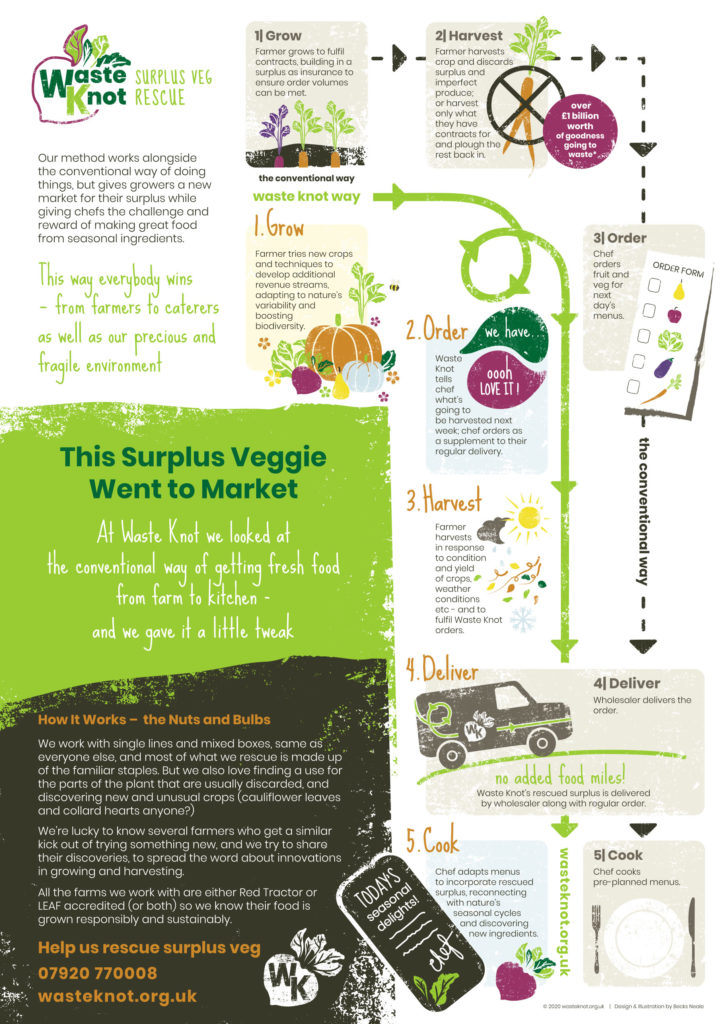
‘Waste Knot’s vision included big plans and they were eagerly ready to take the world by storm. This meant their brand identity and styling needed to step up to match!’
“Becks, LOVE LOVE LOVE!! Colours are incredible and the favicon – OH MY WORD, AMAZING” Jess L. Founder, Waste Knot

‘The collection of illustrations were developed with a screen print effect style to evoke the feeling and texture of handmade and down to earth. A core characteristic of ‘screen printing’ is the natural imperfections the process creates which all form part of the charm and ties in seamlessly with the feel of Waste Knots values and mission’.

“WOW WOW WOW!! Becks, I love it – thank you so much! You have absolutely captured the ethos and feel of what Waste Knot is… it looks phenomenal!” Jess L. Founder, Waste Knot