RunningSpace is on a mission ‘to see a world where every life is lived in all its fullness and not one is lost to suicide’
The culmination of searching and finding purpose
The charity’s aim is to achieve this mission by:
- Raising awareness of suicide rates and prevention mechanisms.
- Empowering and enabling groups to provide suicide first aid and recovery programmes.
- Providing support and improving wellbeing.
And pioneering this through a worldwide movement of runners.
Pioneering brand
Being involved from the founding of the charity provided the luxury of starting from a clean page. Laying the right foundations to establish and create this pioneering charity’s new brand identity. The design process started, as always, with their amazing brand story and purpose. Full of emotion, motivation and powerful sense of fulfilment.
“Every Person you run with has treasure and riches buried deep within them, buried under hurt and pain of abuse, abandonment and rejection. Your purpose is to run, and in running to help shake the dirt off their lives and pull out the treasure” A personal prayer.
There were three particular audiences the brand needed to communicate with and support;
- Churches and community organisations (supporters, advocates, providers).
- Runners, whether individuals or teams from groups and corporations (supporters, advocates).
- People at risk (recipients of support).
The brand identity design
The new identity needed to create a sense of a welcoming, inclusive safe space. One that emanates the feeling of hope and purpose. RunningSpace provides the opportunity, understanding and support to empower individuals to make a change and live their life to its fullest.
Their new identity also needed to be adaptable for digital and printed use; from fundraising merchandise, social media platforms, campaigns, resources, race signage and paraphernalia etc.
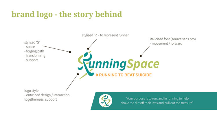
Combination logo design – the story behind
The individual runner represents the pioneering aims of the charity. Communicating a dedicated focus on the individual, whether as a supporter or as a recipient. For both, it is about instilling confidence and worth.
The road to recovery for the recipient is challenging and the very first step is acknowledging how they are feeling. This enables and empowers them to make the change they want to see. The charity is alongside them to fully support and value them. From identifying the cause of pain; physical, emotional and mental, through to navigating a course to restoration.
For the supporter it’s the training, either physically for running, or for gaining knowledge in how to best respond to make a difference. Being a part of something bigger. Everyone is running ‘shoulder to shoulder’, bolstering each other as they forge their individual paths and discover their value.
The logo design has the flexibility to work as a brand mark and be used stand alone, or as a combination mark with the charity name and tagline. The brand mark stands for everything the charity represents.

The stylised initials entwine and interlink to highlight the support and team spirit. The letter ‘R’ is stylised to represent the emboldened, focused runner, whilst the letter ‘S’ symbolises the forging of a path forward. The smooth curves suggest approachability and safety whilst capturing movement and direction. The brand name itself uses a strong, italicised sans serif font to reflect a forward motion. Taking action to make a difference.
‘Running to beat suicide’ became their tag line which immediately anchors their mission and purpose. The inclusion of the arrow head detail adds a sense of urgency and action required to beat suicide. Act now.

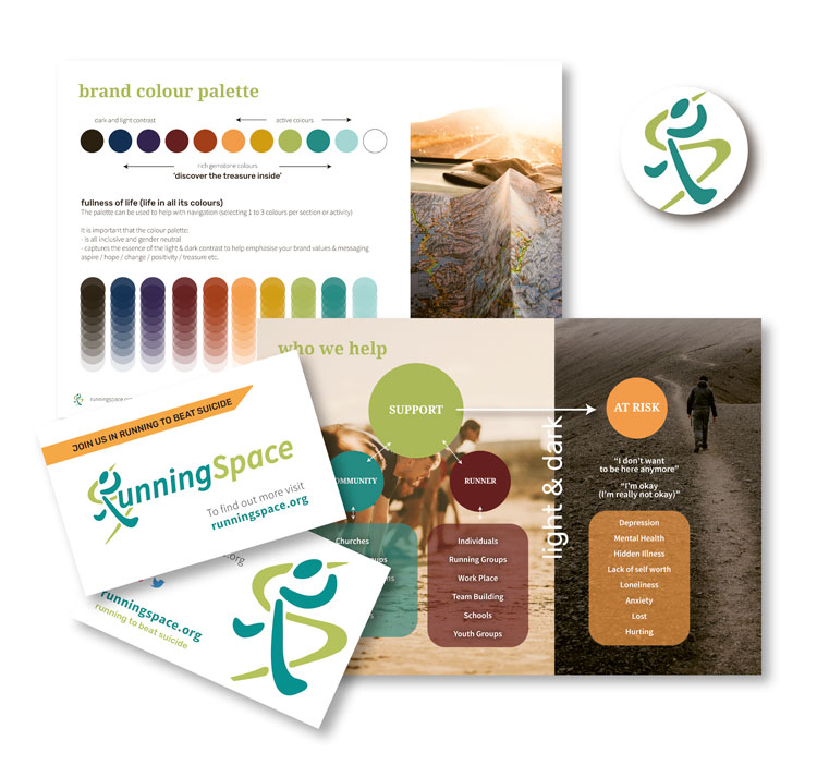
Brand colour palette
In creating the brand colour palette, it was important to represent the ‘fullness of life’, light and darkness, with a reassuring emphasis on hope. To achieve this we drew upon rich gemstone colours as supporting colours, giving depth and brightness. This provided flexibility and room for future growth of the charity, where the colours can be used to define new activities, events, educational resources for example.
The core brand colours are active, gender neutral, and optimistic, which draw on nature and promote life, hope and growth.
Brand typography styling
In styling the charity’s brand typography, serif and sans serif fonts were handpicked and paired to create welcoming space. A space that feels familiar, friendly and open.
The charity’s communications also need to be informative. Accurate, important information needs to be provided in a way that can be easily and clearly identified, quickly referenced and understood immediately. Its role is to help save someone’s life. This is achieved by defining a minimalist, bold, sans serif font. It needs to stand out. Being a bold, easy to read font it can be flexibly used on different brightly coloured backgrounds to set it apart. The colours can also be used to create a creating a point of differentiation between campaigns, events and actions.
Brand literature design
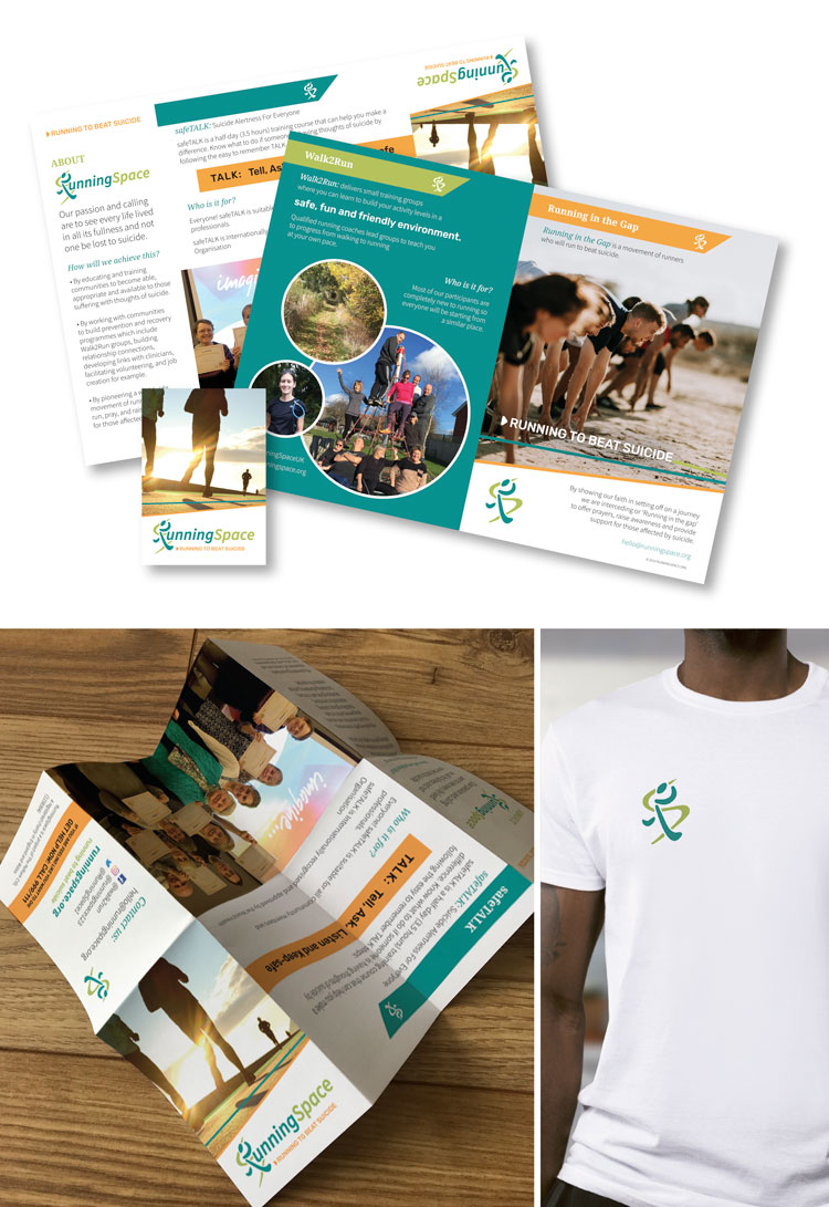
Creating an informative flyer to introduce the charity and their different activities. The innovative design layout was created and styled around the idea of folding map. This has proved really popular, ‘People love them’, leading to a second print run.

Does your brand communicate your purpose?
Is an aspect of your branding making you feel uncomfortable? Is it preventing you from connecting and communicating with your ideal audience?It might be that your organisation has changed direction, or you are growing to offer an additional service, perhaps to a new audience. If your branding is feeling out of alignment, you’re missing out on raising awareness, vital funding and reaching those who need you.
Contact me today to see how we can work together to help you achieve a brand that you love.
Image: RunningSpace (team) / Unsplash (stock imagery)
Design: Becks Neale
