Waste Knot are a purpose-led organisation through and through, waging a war on waste from field to plate!
The challenge:
Brand identity development to strengthen positioning and adaptability
From Waste Knot’s strategic vision it was clear that their current branding wasn’t adaptable for their needs. They felt restricted. For instance, at the very tip of the iceberg, the only logo file that existed, was in one format. A web file. Which wasn’t scalable.
Waste Knot’s vision included big plans and they were eagerly ready to take the world by storm. This meant their brand identity and styling needed to step up to match!
The solution
The Waste Knot brand, has the founder, Jess, running intrinsically through it. It’s fun, modern, quirky and innovative. Full of energy and determination to make a difference. So one of the short term goals was a brand refresh and development, to align and create the different design assets that Jess and the team needed to communicate their ethos and mission, packed with personality.
The process
The process started by reviewing what was currently in place. Gathering together existing colours, fonts and imagery. Identifying what elements aligned well with the vision for the brand and which one’s needed replacing.
First up refreshing the logo.
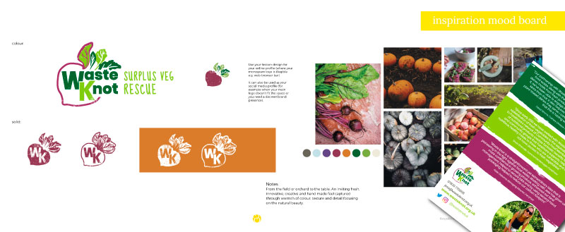
The original logo was made up partly of photographic elements, flattened textures, and a typeface. The logo needed to be redrawn and stylised to make it adaptable and scalable. This included a strong new font handpicked to pair well with the character font already in use.

The concept of the beetroot metaphorically encompasses the Waste Knot mission of rescuing surplus and misshapen fruit and veg. Because the whole of a beetroot can be eaten from the very tips of its green leaves right through to its roots! Nothing wasted!
The colour palette was refreshed and developed to work across print and screen. Creating a rich, delicious colour palette based on colours found in nature, with the core colours inspired by the main brand icon; the beetroot.
From here I developed the logo type into the different formats and colour versions needed; including full name, abbreviated, with tagline, stacked, horizontal and favicon.
“Becks, LOVE LOVE LOVE!! Colours are incredible and the favicon – OH MY WORD, AMAZING” Jess L. Founder, Waste Knot

Brand styling
Next was the brand styling and guidelines for use so that the team have a handy reference to help them readily implement the brand refresh and update their marketing ongoing.
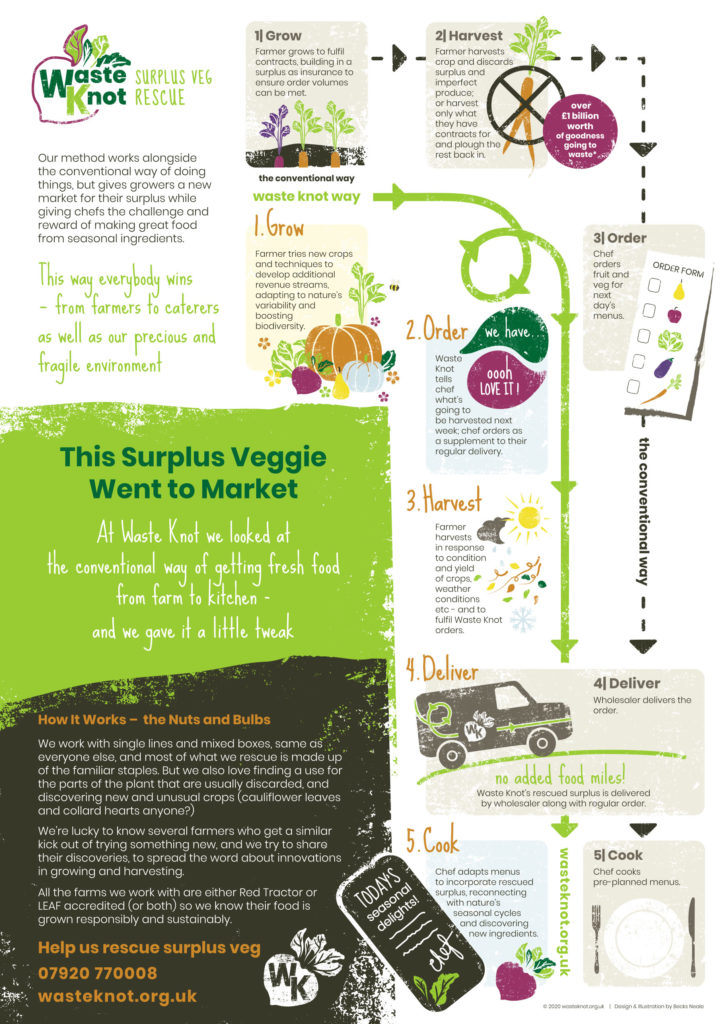
Then establishing the house style for illustrations. Creating an illustrated infographic to clearly communicate the Waste Knot way and how it works alongside the conventional way but with twist.
The collection of illustrations were developed with a screen print effect style to evoke the feeling and texture of handmade and down to earth. A core characteristic of ‘screen printing’ is the natural imperfections the process creates which all form part of the charm and ties in seamlessly with the feel of Waste Knots values and mission;
- rescuing surplus and misshapen veg
- love of being outdoors and down in the fields getting muddy
- responsibly grown goodness and virtue
These illustrated assets were then developed into infographics, informational literature and display material.

The positive impact
“WOW WOW WOW!! Becks, I love it – thank you so much! You have absolutely captured the ethos and feel of what Waste Knot is… it looks phenomenal!” Jess L. Founder, Waste Knot
The display artworks have already taken to the roads. And armed with their brand guidelines and bespoke design assets, Jess and the team are gradually implementing their new identity across social media platforms, with their website excitingly under development ready to showcase Waste Knots amazing mission.

“Becks helped me redefine my brand and get the true meaning and ethos of what we stand for conveyed in clear messaging and logos. She listened to everything I had envisioned and managed to perfectly interpret it into visual collateral for me. I was absolutely thrilled to see my business and the way we work come to life through her expert imagery and penmanship. Thank you so, so much Becks – you’re an absolute star!” Jess L. Founder, Waste Knot
Strengthening your brand identity
If you’d like help to strengthen your brand identity, establish your positioning and rally support for your cause let’s have a chat.

[…] organisation waging a war on waste from field to plate and how I developed and created a new brand design for them propelling them forward onto winning this […]