‘A good investment’
Beverley Poole, the founder of Aspire4business, is a business power force of energy and drive, drawing from a wealth of industry experience and successes. At the heart of her work is people. Providing individuals, businesses and executives support, opportunities, encouragement and training to help them reach their potential and aspirations.
The branding challenge
To create an accessible, international, academic brand that brings the three different entities that make Aspire4business together as a collective; Academy, Retreats, Events. The brand needed to provide direction, support and an inspiring, safe space for both personal and professional development.
A space to connect specialists together whose skills are invaluable to business, to support and share knowledge and help others achieve their goals.
“I asked Becks to design my new branding. She listened to me, asked lots of relevant questions, I completed worksheets and she really made me think about my who and why! After an initial change of colour palette, I am delighted with the end product. She even included some avatars for me to use which just added to the branding. Becks was not the cheapest quote, but I felt she would listen to what I wanted. Take a look at aspire4business.com Academy, Retreats, Events. Happy customer.” Beverley Poole, Director and Founder of Aspire4business

The brand strategy
From the outset it was clear we needed to create an umbrella brand as the main Aspire4business identity that reflected Beverley’s values of leadership, sustainability and personality. Then within this develop the three sub brand entities to work together collectively as well as individually.
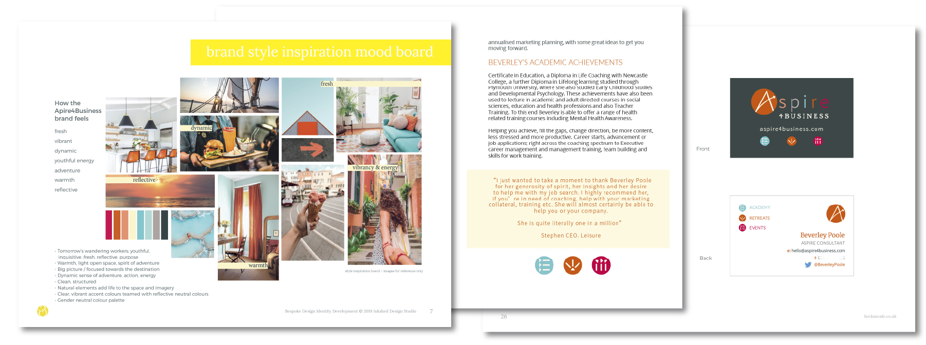
After the visual research and creation of mood boards to capture the direction and positioning of the brand, came the development of a strong, vibrant, dynamic colour palette to help set the brand apart within the business consultant and support landscape.

The final colour palette brings an energy and freshness, bursting with warmth and spirit. It’s anchored with the slate grey adding the characteristic attributes of depth of experience and stability. Perfect for body text and for creating striking backgrounds. It beautifully offsets the core colours, allowing them to shine.
‘Aspire; to direct one’s hopes or ambitions towards achieving something of great value’
The story behind the logo design.
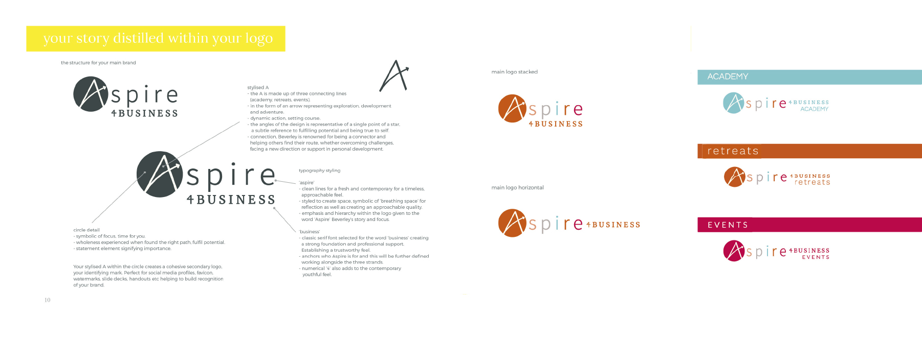
The stylised letter ‘A’ in the form of an arrow, was created to symbolise the three connecting entities; academy, retreats and events. It represents exploration, development and adventure. The setting of the individual course and goals. The logo typography teams together a contemporary and classic font for a timeless, trustworthy and personal feel.
The identifying mark from the main logo, was then filtered into the individual sub brands. Each denoted through use of a chosen core colour and teamed with a unique font.
![]()
From here icons were developed to coordinate and increase association with the main brand whilst providing a unique, individual element that represented each sector:
- academy – learning / checklist / pile of books
- retreats – sunrise sunset / adventure
- events – communicative heads / networking / collaboration
The styling brings all the elements together cohesively. Strategically using colour, typography and brand marks so that each entity works succinctly as part of the whole brand collection as well as standing individually. Providing plenty of options and flexibility of use.
The results
‘A brand’
An identity. A distinct style and brand collateral that celebrates all of the dedicated business development from the previous two years and realises the vision in full colour. One of the things Beverley values highly about the result is the fact that her new brand ‘says all the brand story’, and that she ‘recognises herself within it’.
“It all tied together which I loved, it feels comfortable and familiar”
Armed with their style guide and brand assets ready to use in-house, the Aspire4business team deftly set about establishing their offline and online presence, including their new website, social media platforms, eco-friendly event merchandise and of course their inspirational and educational academy platform.
Since the launch of the Aspire4business’ new brand identity the business has grown in confidence and strength, increasing engagement and growing recognition.
“Everything started to take shape… it was a good investment” Beverley Poole, Director and Founder of Aspire4business
Aspire4business is an award winning brand, including receiving the GOLD Award at SOStar awards ‘Innovation & Future Proofing’, shortlisted for ‘Education & Mentoring’ 2020 and a finalist for ‘South Coast Tech Company’ and ‘Tech Start Up Company’ 2020. A fantastic achievement in such a short space of time. Congratulations Aspire4Business team – looking forward to seeing you continue to grow and thrive.
Contact me about your brand vision for your organisation and how together we can set the fundamentals effectively in place to get you there.
Design: Becks Neale
